Ads allow content creators to provide free useful and compelling content to the public. We may earn money or products from the companies mentioned in this post. See the Affiliates and Disclosures page in the top menu of this website for detailed information.
The best fonts for Pinterest pins
If you’re looking for free fonts in Canva to pair as you design for Pinterest, presentations, business cards or other places you need font impact this is the post for you.
Table of Contents
Why fonts are important for Pinterest pins
Fonts play a crucial role in Pinterest pins for several reasons:
- Attention-Grabbing: Fonts contribute to a pin’s visual appeal. Bold, stylish, or unique fonts can catch the viewer’s eye while they scroll through their feed, increasing the likelihood of engagement.
- Brand Consistency: Using consistent fonts across your pins helps establish a recognizable brand identity. When users see pins with similar fonts, they start associating that style with your content, fostering familiarity and trust.
- Readability and Accessibility: Clear and legible fonts ensure that your message is easily understood. Pins with easily readable fonts are more likely to be engaged with as they communicate the message effectively. Some script fonts are very difficult to read on devices.
- Visual Hierarchy: Fonts help establish the hierarchy of information on a pin. Using different font sizes, styles, or colors can emphasize key points, making it easier for users to grasp the main idea even with a quick glance.
- Conveying Mood or Tone: Different fonts evoke different emotions or tones. Serif fonts may convey elegance or formality, while playful or handwritten fonts can bring a more casual or creative feel to the pin. Choosing the right font helps set the mood you want to convey.
- Complementing Visuals: Fonts should complement the overall design and visuals of the pin. The right font choice can enhance the aesthetic appeal and cohesiveness of the design.
- Mobile-Friendly Design: Given that a significant portion of Pinterest users browse on mobile devices, using fonts that are easily readable on smaller screens is essential for engagement.
Many people don’t realize Pinterest pins get scanned by AI to help categorize the content and it cannot read script fonts. Of course, script fonts look beautiful but for functional purposes, they don’t work.
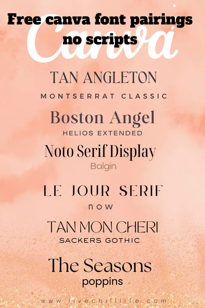
Examples of optimized fonts on Pinterest pins
In this example below you see Travel Guide, an important keyword on this pin is in script font and won’t get read by Pinterest.


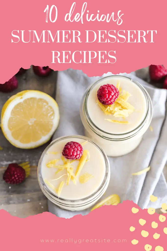
Here you can see dessert, an important keyword for this pin, is in script. By rewording the important keywords SUMMER, DESSERT, and RECIPES all are in non-script font and the funzie word delicious can stay in script font to add visual interest.

Pairing non-script fonts on Pinterest often works well due to readability and visual contrast. Here’s why:
- Readability: Non-script fonts are typically easier to read, especially in smaller sizes or on mobile devices. You know from being a Pinterest user that you will often scroll quickly through a feed. This is why using clear, legible fonts ensures that your text is easily comprehensible at a glance. Play around with spacing, bolding your font, and sizing for impact too.
- Consistency: Using a mix of non-script fonts can create a consistent and cohesive visual identity for your Pinterest content. This is known as branding. Consistency in font choice helps establish brand recognition and makes your pins instantly recognizable to your audience.
- Visual Contrast: Pairing a non-script font with another typeface (serif, sans-serif, etc.) creates a visually appealing contrast. it breaks up the content and makes it (almost) as exciting as the images you use. This contrast can draw attention to specific elements, like headlines or important information, making your pins more eye-catching amidst a sea of content.
- Versatility: Non-script fonts tend to be more versatile across different design styles and themes. They can be easily adapted to various pin designs, whether it’s for recipes, quotes, tutorials, or product showcases.
- Accessibility: Choosing non-script fonts often enhances accessibility, ensuring that your content is readable for all users, including those with visual impairments. Clear, straightforward fonts contribute to a better user experience for everyone.
Can I still use script fonts on Pins?
There is no denying script fonts are beautiful especially if you’re marketing to women. Elegant and feminine script fonts can look romantic, serene and chic. They work great for fashion and beauty pins as well as home decor and recipe pins.
If you’d like to use script fonts, use them for words that aren’t keywords in your pin.
You see the keywords in this image are all in regular fonts and the script is accenting words that wouldn’t be keyword targets.
No script font combinations for social media